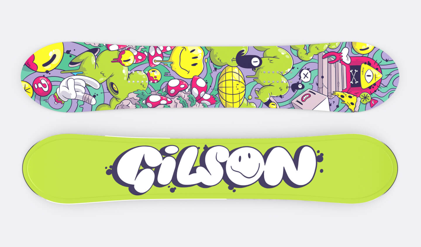
Gilson Snowboards board design
Gilson Snowboards reached out to me with an exciting opportunity to collaborate on the design of a snowboard graphic, incorporating my signature cartoon style. The initial brief provided was pretty open-ended, allowing for creative freedom. Although starting with a blank canvas can be a daunting task, I embraced the challenge.
To gain inspiration, I delved into Gilson's extensive catalogue, exploring their decade-long journey in the snowboarding industry. Their compelling narrative began in a classroom and evolved into a barn, eventually transforming into a full-fledged warehouse. What sets Gilson apart is their unique commitment to collaborating closely with artists to craft a diverse array of board graphics. Beyond aesthetics, they embody the qualities that define a reputable company in my perspective: a dedication to locally sourced materials, impeccable craftsmanship, and a strong emphasis on carbon reduction.


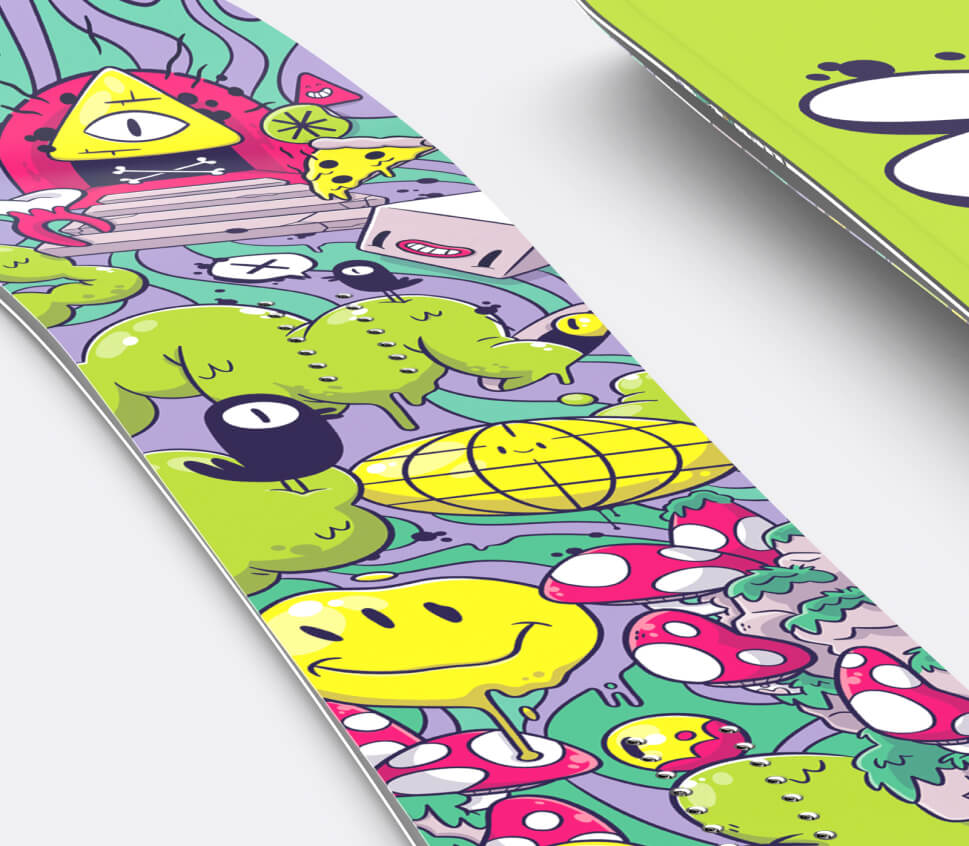
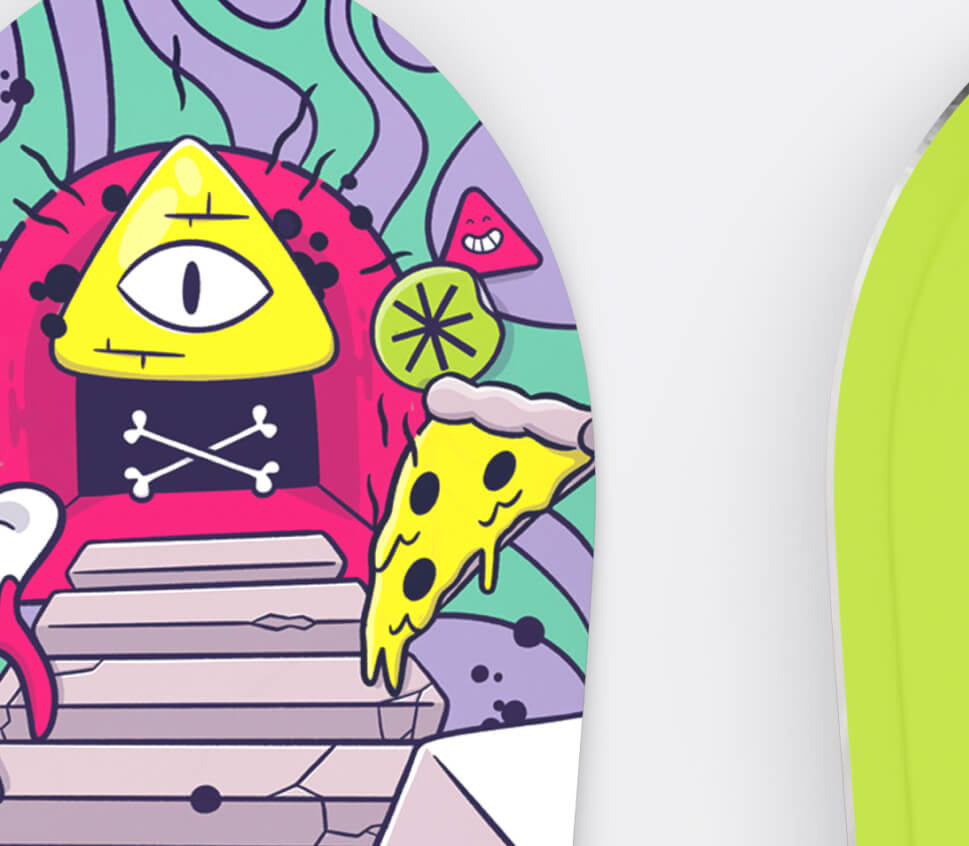
After digging deep into research, brainstorming, and creating mood boards, I dove into the sketching process. My aim was to craft something that would grab attention from a distance on the mountain, yet invite closer inspection for all the little details. That's when I settled on this surreal, dreamy style for the snowboard.
This design allowed me to pack in a variety of captivating images. The bold reds on the mushrooms, cheerful yellows highlighting smiley faces and eyes, along with unexpected bursts of color, really pop against the textured, psychedelic swirls in the background. Putting this graphic together was an absolute joy, piecing together the puzzle to ensure each element found its perfect spot.
